

A&F Product Page
Exploring image zoom and layout

A&F Product Pages
Explorations on viewing products in unique ways to make it feel like you’re holding the product
Taking a closer look
While working at Abercrombie & Fitch, my main focus was on interaction design and prototyping. As a team we worked through a few different product features that made some unique updates to the product page (the spot on the site where you view a single product) that updated the aesthetic and added new interactions.
Images are important to any digital customers, and the product page creates is a pivotal purchase decision point.
While we had continuously learned about images through split testing and repeatedly changed the photography strategy, look and feel, we had not made significant changes to image presentation layout on the page.
A competitive audit showed that we were using a similar image layout on the product pages to 7 of 13 competitors surveyed. Together with our product team we decided to use some capacity to split test alternate layouts and zoom functionalities with a focus on our desktop users.
This was also a great opportunity to gather data on an area of our product where there wasn’t much previous knowledge.
Competitive Analysis
Goal
Increase accessibility to alternate images and desired zoom.
Opportunity
Allowing users to have greater control over the images they see and how large will customize the shopping experience and feel more tailored.
Known Behaviors
“Jump Around” – Customers tend not to move through the alternate images in a linear manner, instead skipping around to compare the images.
“Too Much Zoom” – The zoom functionality introduces friction to certain users, but the ability to view the items up-close is appreciated.
User test participants usually expect a magnify function rather than a full-screen takeover, so are often surprised when they click the images.
Modifying the layout
In the first wave of testing, I focused on an alternate layout for the images that would enhance the visibility and ability to add more images than the design could handle in the original state.

The starting design for the image layout. A thumbnail on the left allows a user to select a new enlarged image.

An option to have an image carousel with multiple ways to trigger the next image: Pagination and thumbnails below.

Next I worked on an option where the thumbnails would swipe the images. Alternate functionality would be to click and drag or swipe on the image to view next.

This is getting closer to a testable design, the images scroll while the thumbnails and swatches are “sticky”.

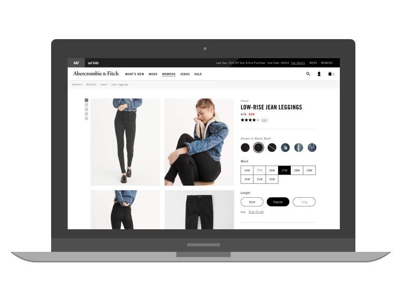
One step closer, I removed the thumbnails and put the images into a grid design, allowing for many more images than could be hosted in the original design.

And we’ve arrived! This was the design that went into a first round of testing. A sticky side rail and images in a grid with alternate sizes as determined by the brand.
A new way to zoom
Second time through, I worked on a new way to zoom in on the images. The original state was a full-page takeover that sometimes seemed abrupt to our users and didn’t allow for the user to control the target area or the zoom multiplier.

The original zoom functionality, a full screen takeover with thumbnails.

The first option was a modal that is similar to the Quick View modal we were already using but with added zoom control.

Next I checked out doing a type of “digital loupe” where the mouse showed a zoomed version to the right of the screen. This option did have the drawback of covering some content.

Finally we came to the decision to test a version that allowed both a click to expand an image in the grid, and on hover would zoom the image.
Know where you’re going
The last change I made to the page was based on testing feedback: Adding a way to navigate through the image grid and easily see how many images were on the page.
An abstract form of wayfinding seemed like a nice way to replace the previous thumbnail functionality.

I tried putting it on top to save some width on the screen.

A better version was a visual mimic of the pattern on screen

Better yet was a version that would expand with the images as they expanded.
Final Touches
After finalizing the design and testing the last prototype, I worked on a loading state for the page. Since the pages can have a large amount of images loading in a large file size at once, we needed to account for slower downloads. The solution was to intentionally delay the load so that the page could “count” the number of images to decide on the initial layout before revealing any images to the user.
These are some test loaders made with Lottie.
The test loading sequence:


This is a project I worked on while employed at Abercrombie & Fitch.
Up next

Legal AI Chat App
Creating a paradigm shift in workplace routines